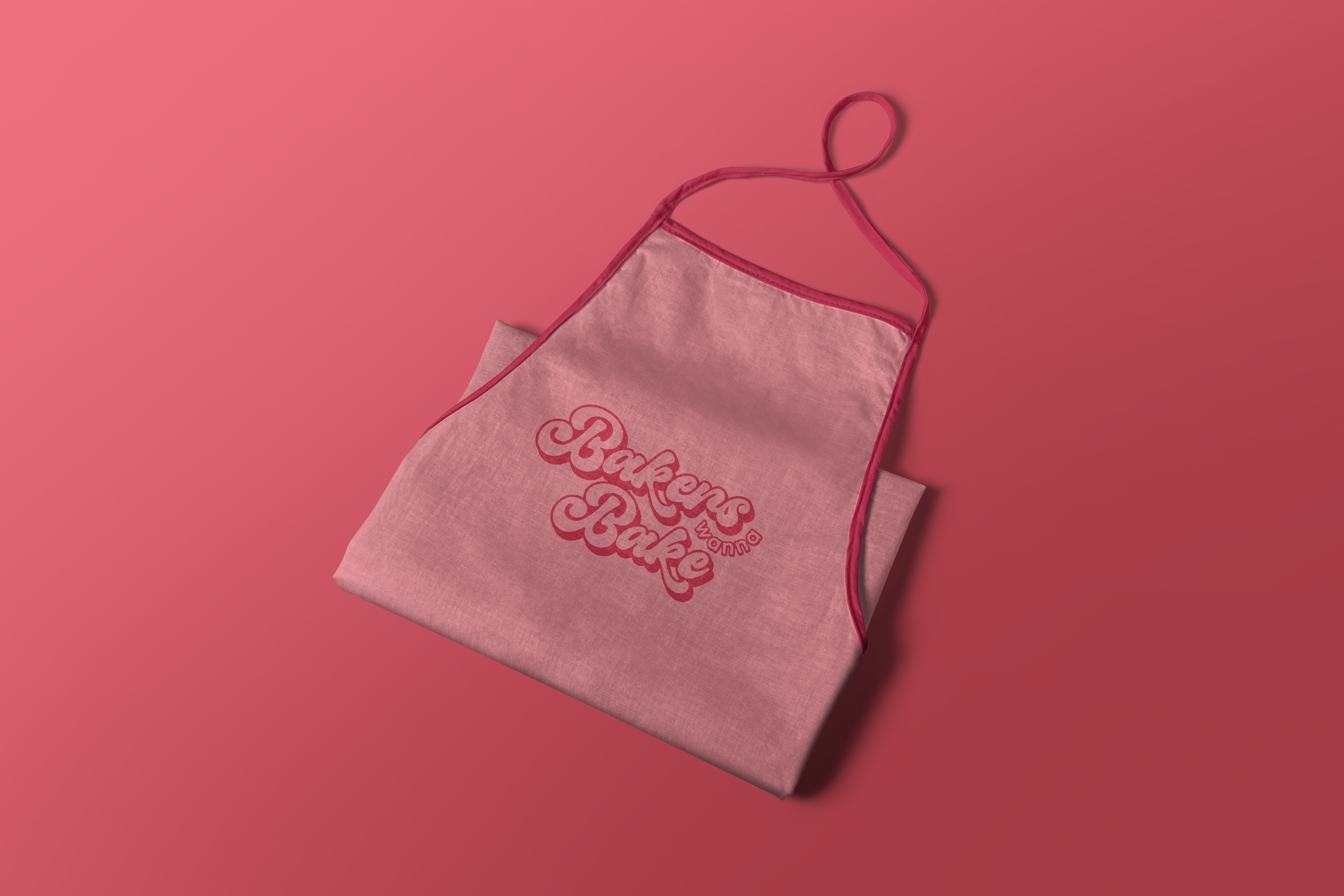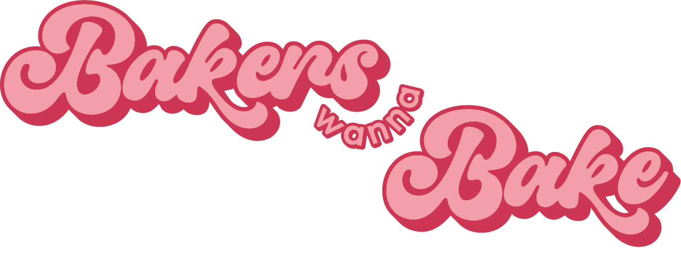

This rebrand for local bakery Bakers Wanna Bake embraced a sense of fun and unfiltered creativity. Keeping the original name and signature pink, the new identity introduced an 80s‑inspired retro script font that brought personality and warmth to the brand. The script’s flowing shapes echoed piping bags and melted chocolate, and the lettering was carefully adjusted to create clean negative space within the logo lockup. A contrasting pop of orange elevated the pink and added energy to the overall palette.
Supporting brand assets were developed for social media, packaging, and uniforms, including bold retro‑style squiggled lines that added structure while maintaining a playful feel. A set of sticker‑like vector illustrations of the bakery’s signature goods tied the brand back to its purpose in a way that felt charming rather than literal. The result is a bright, recognisable identity that captures the bakery’s personality and brings a sense of joy to every touchpoint.